Hello, fellow crafters
Today I want to share tips for taking your card-making to the next level, when using die-cuts.
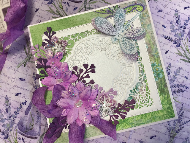
I will use this card with a lush lilac flower cluster (created using Heartfelt Creations lush lilac stamp, die and mould) as example to explain the tips. The card was not made with the tips in mind, but when looking for examples, I realised that this card fits all the tips I want to share today.

TIP #1: Use complementary colours
Complementaries can
make each other appear brighter.
Complementary colours are two colours that are on opposite sides of the colour wheel. In
their most basic form, they are one primary color and the secondary
color that is created by mixing the other two primaries. For instance,
the complementary color to yellow is purple, which is a mix of blue and
red.


Looking at the colour wheel, it is easy to identify the first set of complementary colours:
- yellow and purple
- blue and orange
- red and green
You will find
that the following colours are also complementary:
- yellow-orange and blue-purple (indigo)
- orange-red and blue-green (aqua)
- red-purple (pink) and green-yellow
I found a lovely, workable online tool for selecting complementary colours at this link - you click on a colour wheel the colour you want to find a complementary colour for, and a perfect choice is shown. Here is an example: I clicked on the pink-purple and the green was suggested. You can then match the colours with the cardstock or inks in your stash.

On this card, I used the complementary colours of lime green (yellow-green) and pink-purple. You will notice how the colours pop.
TIP #2: Use balance in colour
It is important to use balance in colour. for example, if you use a bold red, then you should use other bold colours with it. In the card above, balance in colour was established by using the same "weight" - softer lime-green with softer purple-pink.
TIP #3: Use balance in layout
Balance in layout means that not all the elements on the card should be bundled into one place. Notice how the small arrangement of flowers in the top right-hand corner provides balance, being placed opposite the focal point of the cluster of lush lilacs. without that small cluster, the focal point would appear to be too "heavy".
TIP #4: Add interest to the focal point
Interest is created by adding a subtle element to place even more emphasis on the focal point. On this card example, the white leaf frame creates a backdrop that is subtle, yet makes the flower clusters stand out.
TIP #5: Add layers
Layers add extra interest and dimension, giving "life"to your cards.
On this card, an additional layer was created by cutting another leaf frame from silver mirror cardstock and adhering at, slightly off-set to the main white frame. the small flowers are flat enough to create layers, dimension, and texture, without creating a bulky card. The card fits well into an envelope.
TIP #6: Repeat elements
In art, design and visual displays, there is a principle called the principle of repetition:
the repeated use of particular elements of visual arts to create a pattern, movement, rhythm, or unity. In this card example, the principle was applied in repeating the flowers (though in a smaller cluster for balance). The principle was also applied in repeating the "shine" effect - using silver flower pearls to repeat the use of silver mirror cardstock for the off-set frame behind th3 white.
I hope these tips will help in enhancing your card-making skills, and encourage you to experiment. Please do try the tips, and share your creations on our Facebook page @purplemangolia.papercraft.
Happy crafting, until next time.
Marie Smith


